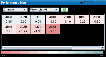
The Performance Map lets you view the important stock market Information by displaying dynamic movements of the market via color changes so that you can spot the differences at a glance by significant color changes. This in return helps to identify the current market trend for a selected exchange.
Performance Map for a Watch List provides the market information for all symbols in the Watch List. Each colored cell in the map represents an individual symbol.
The following color codes indicate the Symbol performance:
| • | Green indicates that the value is booming |
| • | Red indicates that the value is dropping |
| • | White indicates a neutral value |
Set Performance Map criteria
The Performance Map has a set of predefined criteria, under which information is displayed.
The available criteria are:
| • | Change |
| • | % Change |
| • | No. of Trades |
| • | Volume ‘000 |
To view the Performance Map:
Method I
| 1. | Open the required view, i.e.: Watch List / Market Watch. |
| 2. | Go to the View menu on the Main toolbar > Select Performance Map. This displays the Performance Map window. |
In the Performance Map window:
| 3. | Select the Criteria and the Exchange/Watch list from the relevant drop down lists in order to view the Performance Map based on the selected criteria . |
| 1. | Open the required view, i.e.: Watch List / Market Watch. |
| 2. | Right click on any symbol row. |
| 3. | On the Right click menu > Select Performance Map. This displays the Performance Map window. |
In the Performance Map window:
| 4. | Select the Criteria and the Exchange/Watch list from the relevant drop down lists in order to view the Performance Map based on the selected criteria . |
Performance Map window
Note: The Criteria and Exchanges available in the Performance Map depends on your subscription.